A one-stop-destination for data analytics, engineering and everything in between
A one-stop-destination for data analytics, engineering and everything in between
Data visualization is the presentation of your data analysis in a pictorial or graphical format. Its goal is to communicate information clearly and efficiently to users and enable decision-makers so they can grasp difficult concepts. It’s about techniques and forms of art as much as tools and frameworks/languages. The goal should not be to debate a tool or a language or application versus open source. Fernanda Viegas and Martin M. Wattenberg suggested that an ideal visualization should not only communicate clearly, but stimulate viewer engagement and attention (1).
Covid-19 has shown the importance of dashboards and visualization for everyone. Various countries and even states/regions have created their own COVID-19 dashboards to educate people on the pandemic. I monitor the one from John Hopkins.
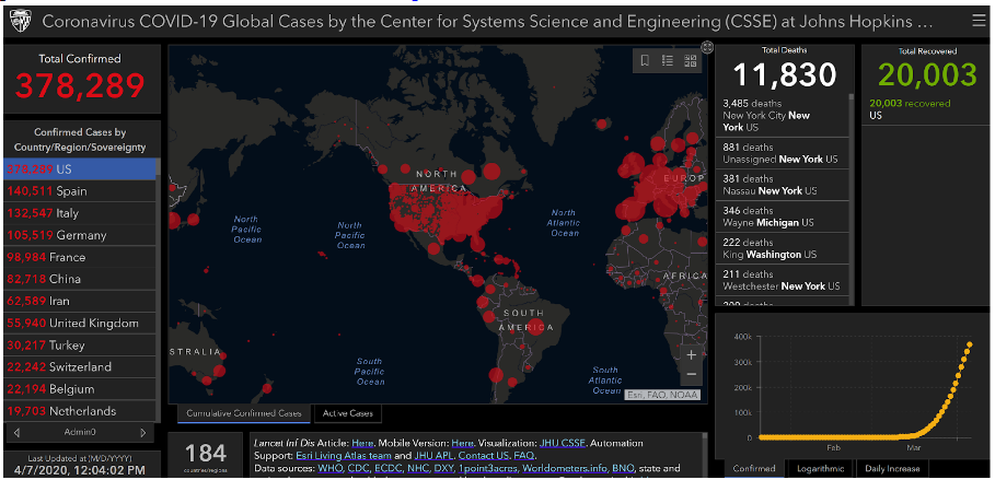
With its black world map strewn with red circles and global, country, and state counts of cases, deaths, and recoveries, the Coronavirus COVID-19 Global Cases tracker 8 sticks to the basics—no fancy graphs. Yet the site, which gets millions of hits a day, has become the most authoritative source for COVID-19 case data. It is used by news organizations and government agencies around the world. Its dashboard has been copied by states and countries. It has been spotted on a wall in a photo of the U.S. Department of Health and Human Services’ coronavirus war room.
Various data analytics sites such as Kaggle (3) and Tableau (4) have provided John Hopkins Dataset for anyone to analyze and create dashboards. The data science community has jumped on those datasets and created their own versions of dashboards. Here is one created by Jeffrey Shaffer.
Charts on flattening the curve are commonplace. Various newspapers and magazines such as NYT, Financial Times, and The Economist are also doing a great job with their charts and dashboards. Matthew Mayo of KDNuggests writes about John Burn-Murdoch’s data visualization for the Financial Times (2).
The use of data visualization is not a new phenomenon – we can go back in time from John Snow’s (not from Game of Thrones 😊) map of cholera outbreaks from the 19th century (5) to Nightingale’s use of visualizations about mortality in the army (6). This year is Florence Nightingale’s bicentenary celebration (7).
Designing Effective Visualization:
There is a saying, “A picture is worth a thousand words.” Data analysts and data scientists should grasp this concept and not just focus on models. It is almost impossible to make sense of data in a spreadsheet or other quantitative formats.
Dashboards and other visual elements such as infographics allow generating answers easier. They democratize the understanding of data – not limited to statisticians, data analysts, or data scientists. Data visualization is thus powerful, as it allows users from C-Level to entry-level and various domains such as sales, HR, finance, healthcare, and more to get value from their data. The science behind effective data visualization is to understand human perception and how we visualize objects – shapes, colors, etc. Designing effective visualizations is meant to help users learn about parts of their data that they are unaware of. As we know more about our users, designing visualizations become better.
Concepts of Storytelling in Data Science:
Data in dashboards and spreadsheets only tell you what is happening. But they do not tell you why. Data storytelling is the process of creating a story out of data analysis findings, allowing regular businesspeople (laymen) to understand the possibly complex insights and apply them to a business decision or action.
Data storytelling merges three key fields of expertise – Data science, storytelling, and data visualization. The ultimate goal is to tell a story with the data, including the data itself, the narrative, and accompanying visuals.
To understand better dashboards, data visualization, and how to create stories from your data, come join my workshop as part of the ODSC Virtual Conference, “Data Analysis, Dashboards and Visualization with Tableau – How to Create Powerful Visualizations Like a Zen Master.” We will go through a few datasets from the initial analysis to creating visually-appealing dashboards and end with storytelling. We will cover design concepts, better charting techniques, and how to effectively tell stories with your data.
References:
1: Wikipedia- https://en.wikipedia.org/wiki/Data_visualization
2: KDNuggets: https://www.kdnuggets.com/2020/03/covid-19-visualized.html
3. Kaggle: https://www.kaggle.com/sudalairajkumar/covid19-in-usa#us_covid19_daily.csv
4.: Tableau.com: https://www.tableau.com/covid-19-coronavirus-data-resources
5: https://www.theguardian.com/news/datablog/2013/mar/15/john-snow-cholera-map
6: https://www.theguardian.com/news/datablog/2010/aug/13/florence-nightingale-graphics
7: https://www.florence-nightingale.co.uk/nightingale-2020/
8. John Hopkins tracker notes: https://systems.jhu.edu/research/public-health/ncov/; https://hub.jhu.edu/2020/01/23/coronavirus-outbreak-mapping-tool-649-em1-art1-dtd-health/

Boston, Massachusetts
Chicago, Illinois

Mumbai, Maharashtra

 +1 978 330 6045